

Key Takeaways A landing page should make paid traffic easier to convert, not give visitors another broad website experience to navigate. Start with one campaign objective and one primary action. Keep the page promise closely aligned with the ad that brought the visitor there. Write for Singapore audiences while keeping the message simple and specific. […]
A landing page should make paid traffic easier to convert, not give visitors another broad website experience to navigate.
A high converting landing page singapore campaign begins before anyone chooses colours, layouts, or animations. The page needs a clear job within the wider campaign, whether that means generating enquiries, registering event attendees, or encouraging a visitor to request a consultation. When the objective is vague, the page usually becomes crowded with competing messages. Strategy gives the design something practical to support.
The page should continue the action suggested by the advertisement. An ad promoting a consultation should lead to a consultation-focused page, while an event campaign needs information and a registration path that answer the visitor’s immediate questions. Sending every click to a general homepage often introduces unrelated navigation, offers, and content.
A useful first step is to write the campaign objective in one sentence. If the sentence contains several actions, separate campaigns or pages may be needed. Inno Panda describes this approach as building focused, single-goal pages that guide visitors towards a specific action, which is a sensible foundation for paid traffic.
Search visitors often arrive with a defined problem or request. Their landing page can therefore be direct, with a headline that names the service and a clear explanation of what happens next. Social visitors may be earlier in the buying process, so the page may need to establish relevance before asking for a lead.
The distinction is not absolute, but it affects the opening message. Consider the wording of the ad, the audience targeting, and the reason someone might click at that moment. A page that respects that context feels like a continuation of the journey rather than a generic sales page.
Singapore is compact geographically, but customer needs can still vary by location, industry, budget, and urgency. A property campaign, for instance, may need different entry points for an investor and a first-time buyer. A medical or professional service campaign may also require different levels of explanation depending on whether the visitor is researching or ready to enquire.
Keep segmentation useful rather than excessive. Build separate pages when the offer, proof, or call to action genuinely changes; otherwise, use clear sections or conditional content to avoid creating a maintenance burden. The goal is a closer fit between visitor expectation and page experience.
Define the primary conversion before launch, then decide which supporting actions are worth recording. A completed form might be the main goal, while phone clicks, brochure downloads, or event registration starts can help explain user behaviour. Track enough to diagnose the funnel without treating every interaction as equal.
Benchmarks should reflect the campaign’s starting point, traffic source, offer, and lead quality. A low cost per lead is not necessarily healthy if sales teams receive poorly matched enquiries. Lead quality matters as much as volume when the campaign is intended to produce real customers rather than just completed forms.
Message match is the connective tissue between an ad and its landing page. Visitors should quickly recognise that they have arrived in the right place, with the same offer and a believable next step. This does not mean repeating the ad word for word throughout the page. It means keeping the central promise consistent while adding the detail needed to make a decision.
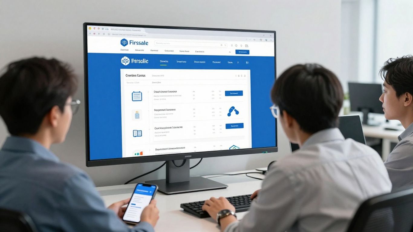
The strongest pages usually make the visitor’s first few seconds easy. They state what is being offered, who it is for, and what action is available. From there, the rest of the page can answer practical questions without weakening that initial clarity.
The headline should confirm the reason for the click. If the ad says a visitor can book an assessment, the page should not open with a broad statement about company history. Put the offer, audience, and meaningful outcome near the top, followed by a short explanation and one primary call to action.
Above the fold does not mean every detail must be visible immediately. It means the visitor should understand the page’s relevance without scrolling through a puzzle. Supporting proof, a concise form, or a short qualification statement can sit nearby if it helps the visitor decide to continue.
Local relevance can come from practical details rather than forced references to Singapore. Mention the service area, operating hours, local contact route, appointment availability, or the business context that matters to the audience. Use Singapore dollars where prices are shown, and make location details easy to verify.
Avoid stuffing every local phrase into the headline. One clear local cue is often more persuasive than a paragraph of exaggerated claims. The page should sound like a business serving people in Singapore, not like a template with a place name inserted at random.
Visitors may wonder about response times, qualifications, appointment arrangements, delivery coverage, privacy, or what happens after submitting an enquiry. The right objections depend on the offer, so review sales conversations and support questions rather than guessing. A short FAQ, process explanation, or reassurance beside the form can remove uncertainty.
Specificity builds confidence. “A member of the team will respond” is more useful when paired with a realistic response window, provided the business can consistently meet it. Avoid guarantees that the campaign or service cannot support.
A page should have a natural sequence: confirm relevance, explain the benefit, provide evidence, answer concerns, and make the next action easy. Visitors do not all move through that sequence at the same pace, which is why repeated calls to action can be useful when they appear after meaningful information.
The path should still feel focused. Keep navigation limited where appropriate, remove links that lead visitors away from the campaign, and make the form or contact method easy to find. Singapore landing page guidance also points to the combined importance of headlines, value propositions, calls to action, localisation, mobile optimisation, and testing rather than treating any one element as a complete solution.
Good structure reduces the amount of work a visitor must do to understand an offer. It gives each section a role and places information in the order people commonly need it. A page does not need to be visually dramatic to perform well; it needs to make the decision feel straightforward.
The design should also accommodate different levels of attention. Some visitors will scan the headline and CTA, while others will read the details before making contact. Clear hierarchy, restrained spacing, and useful subheadings help both groups without turning the page into a wall of text.
The hero section should answer three basic questions: what is offered, who is it for, and what should the visitor do now? Use one primary CTA that matches the campaign objective, such as “Request a consultation” or “Register for the event.” Secondary actions can exist, but they should not compete visually with the main route.
Images should support the offer rather than decorate the page. A professional service may benefit from a credible environment or human interaction, while a product campaign may need a clear view of the product itself. Every visual should earn its space, particularly on mobile.
Features describe what a business provides; benefits explain why that matters to the visitor. Translate technical or operational details into outcomes that are relevant and credible. An engineering supplier might explain how a product supports a particular workflow, while a professional service may describe the clarity or convenience of its process.
Keep each section tied to the original offer. A page becomes harder to trust when it introduces benefits that the ad never suggested or that the business cannot demonstrate. Short paragraphs, descriptive subheadings, and concrete examples generally work better than a long list of broad superlatives.
Trust signals are most useful near the point of doubt. Place credentials near a technical claim, process details near the form, and privacy reassurance where personal information is requested. Relevant reviews, client logos, memberships, certifications, guarantees, or case-study details can help, but only when they are genuine and appropriate to the audience.
The source and context of proof matter. Do not use an impressive-looking badge that says little about the actual offer. A modest but specific explanation of experience may do more work than a row of vague claims.
A call to action belongs after the visitor has enough information to understand the next step. This may be near the hero, after the main benefits, and at the end of the page. Repetition is helpful when each CTA follows a new reason to act; it is distracting when buttons appear without context.
Forms can be placed beside the opening offer for high-intent campaigns, or lower on the page when visitors need more reassurance first. Test the arrangement rather than assuming one position suits every audience. The important thing is that the action remains visible without forcing visitors to search for it.
A form is not merely a design component. It is a request for time, attention, and personal information, so its length and wording should match the value of the offer. A visitor who wants a quick event registration may accept fewer questions than someone requesting a complex commercial quotation.
Lead capture also includes what happens after the click. Clear validation, sensible error messages, a useful confirmation page, and prompt follow-up all shape the experience. A beautiful form cannot compensate for a confusing or silent post-submission process.
Start with the information needed to qualify, route, or respond to the enquiry. Name, contact details, and one relevant qualifying question may be enough for an initial conversation. More fields can be justified when the offer is high value or when the sales team genuinely needs them before responding.
Review every field from the visitor’s perspective. If a question does not affect follow-up, remove it or collect it later. If the team needs a detail to provide a useful answer, explain why it is being requested.
“Submit” tells the visitor almost nothing. A more useful CTA describes the immediate action, such as “Request a callback,” “Get event details,” or “Book an assessment.” The wording should remain accurate; do not promise a quote, appointment, or download unless that is what follows.
The button should stand out, but clarity matters more than theatrical language. Pair it with a short line about response time, privacy, or the expected next step when that information reduces hesitation.
Conditional fields can keep the first view of a form simple while collecting additional information when it becomes relevant. For example, a visitor selecting “business enquiry” may see different questions from someone requesting event information. This approach can improve fit without presenting every visitor with the longest possible form.
Use conditional logic carefully on mobile. The interaction should be obvious, fast, and accessible, with no surprise jumps that make the form feel unstable. Test every path, including invalid entries and incomplete submissions.
After a form is sent, confirm that it worked and explain what happens next. The message can include a realistic response window, an alternative contact route, or preparation steps for a consultation. If the action is an event registration, provide the details the attendee needs immediately.
This stage is also a practical quality check. If users submit forms but do not receive clear confirmation, they may submit again or contact the business through another channel. Make the confirmation page part of the campaign design, not an afterthought.
A page serving Singapore traffic should feel local, but localisation is more than adding a country name. It involves practical details, familiar contact options, readable language, and a reliable experience across devices. The page must also respect the fact that visitors may be comparing options quickly on a mobile connection.
Local context should support comprehension, not become decoration. Keep claims verifiable, use terminology the audience understands, and make it easy to see whether the business serves the visitor’s area or situation.
Start with the narrow screen rather than shrinking a desktop design. Buttons need enough space to tap, forms should avoid unnecessary typing, and key information should appear before large decorative elements. Check the page on common phone sizes and with slower connections, not only on a fast office network.
Mobile visitors often arrive with limited patience. Remove layout shifts, reduce heavy assets, and make the primary action easy to reach. A page that technically loads on mobile but feels awkward to use is still creating a conversion barrier.
Show a Singapore phone number, local address or service area, opening hours, and currency where those details apply. These cues help visitors assess whether the offer is relevant and whether the business is accessible. They also reduce the need to leave the page to verify basic information.
Do not add local details that are not accurate or current. A campaign page should be reviewed whenever office hours, service coverage, pricing, or contact arrangements change.
Different campaigns call for different contact routes. Some audiences prefer a short form, while others want to call, email, or use a messaging channel. Offer the route that the business can monitor and respond to consistently, rather than adding every possible button.
If payment is part of the conversion, explain accepted methods and any important conditions before the visitor reaches the final step. If the campaign is lead-based, make the enquiry process equally clear. Convenience only helps when the back-end response is dependable.
English may be appropriate for many campaigns, but language requirements vary by sector and audience. Review customer data, search behaviour, and sales conversations before deciding whether translated or bilingual content is necessary. A poor translation can reduce trust, so quality control matters.
Even when the page remains in English, plain language improves accessibility. Avoid unexplained jargon, long sentences, and culturally narrow references that make the offer harder to understand.
Conversion performance depends on more than the page’s visual design. Slow loading, broken tracking, missed enquiries, and weak follow-up can quietly waste paid traffic. A campaign landing page should therefore be treated as part of an operating system that includes media, analytics, sales processes, and ongoing review.
Before launch, test the full journey as a real visitor would: click the ad, load the page, complete the form, receive the confirmation, and check where the lead appears. This simple exercise catches problems that screenshots and design reviews often miss.
Compress images, limit unnecessary scripts, and remove components that do not help visitors make a decision. Review pop-ups, cookie notices, chat widgets, and animations to ensure they do not cover the CTA or delay access to the form. Performance work should focus on the first useful interaction, not just a technical score.
Check the page on mobile, desktop, and different browsers. Broken spacing, unreadable text, and inaccessible buttons can affect conversion even when the page appears fine in one environment. Focused landing page design is often discussed in terms of a single goal, speed, and mobile-friendliness, which are practical checks for any campaign build.
Track the action that represents genuine campaign progress, not only page views. Form completions, calls, registrations, and meaningful booking steps may each require their own events. Name conversions consistently and test that they fire once, at the correct stage, without counting refreshes or duplicate actions.
The advertising platforms should receive dependable signals, but reporting should also preserve the wider business context. A conversion that never receives a response is not equivalent to a qualified opportunity. Document the tracking setup so future campaign changes do not quietly break it.
A lead should move promptly from the page to the team responsible for handling it. Confirm the destination, ownership, notification rules, and duplicate handling before traffic is turned on. If the business uses a CRM, map fields carefully so useful context from the campaign is retained.
The follow-up workflow should match the promise made on the page. A stated callback window creates an operational responsibility. Review missed leads and delayed responses regularly; improving that handoff may produce more value than another round of cosmetic design changes.
A useful dashboard connects advertising cost with what happens after conversion. Watch the landing page conversion rate, cost per lead, qualified lead rate, sales progression, and differences between channels or audience groups. Look for patterns over a meaningful period rather than reacting to every daily fluctuation.
The following table gives a practical starting framework for interpreting campaign signals:
| Signal | What it may indicate | Useful follow-up question | Typical action |
|---|---|---|---|
| Low click-through rate | Weak ad relevance or offer appeal | Does the ad reflect the audience’s need? | Review targeting, promise, and creative |
| High clicks, low conversions | Message mismatch or page friction | Does the page confirm the ad immediately? | Test headline, structure, speed, and CTA |
| Many conversions, poor lead quality | Weak qualification or broad intent | Are the form and offer attracting the right people? | Refine targeting, copy, and qualifying fields |
| Good leads, high acquisition cost | Expensive traffic or inefficient funnel | Which stage is raising the cost? | Compare audiences, bids, and page performance |
The table is a diagnostic aid, not a set of fixed rules. A campaign may show several signals at once, so combine platform data with sales feedback before deciding what to change. Campaign conversion tracking is especially relevant when page design, ad activity, and reporting need to be considered together.
A first launch should be treated as a measured starting point, not a final verdict on the page. Testing works best when it answers a clear question and gives each change enough traffic to produce a useful comparison. Randomly changing several elements at once makes the result difficult to interpret.
The right test depends on the campaign’s maturity. A page with broken tracking needs technical repair before headline experiments, while a stable page with enough traffic may benefit from structured A/B testing. Keep the process practical and tied to business outcomes.
Begin with elements that influence the visitor’s decision early: the headline, offer framing, supporting proof, and primary CTA. Test one meaningful hypothesis at a time where possible. For example, compare a specific outcome with a service-led headline, or a consultation offer with a useful downloadable resource.
Do not judge a test only by clicks on the button. A stronger CTA that produces more low-quality leads may be worse for the business. Include downstream quality signals when the data volume and sales cycle allow it.
Once the basic message is sound, compare page structures and levels of information. A shorter form may increase completions, while an additional qualifying question could improve the proportion of enquiries that sales can use. Both outcomes matter, and the best choice depends on campaign economics.
Test proof elements with restraint. A relevant testimonial or process explanation may help, but adding more badges and logos can make the page feel crowded. Change the layout only when you can explain what visitor uncertainty the change is meant to address.
Behavioural tools can show where visitors stop reading, hesitate, tap repeatedly, or encounter elements that do not behave as expected. Treat these observations as clues rather than complete explanations. A heatmap may reveal that a section is ignored, but interviews, analytics, or sales feedback may be needed to understand why.
Review recordings with privacy in mind and look for recurring patterns across devices and audience groups. One unusual session is not a reliable basis for a redesign. Repeated friction is more actionable, especially when it aligns with a drop-off in the funnel.
A page can lose relevance when the offer, ad targeting, season, regulations, or customer questions change. Schedule periodic reviews of headlines, prices, forms, tracking, proof, and contact details. Keep a record of changes so performance shifts can be interpreted rather than guessed at.
Inno Panda’s published service description covers strategy, copywriting, design, development, and conversion tracking for campaign-specific landing pages. That end-to-end view reflects a useful principle: page improvements should remain connected to the ads and follow-up process, not be judged as isolated design work.
A high converting landing page Singapore campaign is built around a clear promise, a focused action, and a complete journey from ad click to qualified follow-up. When strategy, message match, structure, mobile usability, tracking, and testing work together, the page gives paid traffic a fair chance to produce useful business outcomes. The most reliable improvements usually come from steady measurement and practical refinement rather than dramatic redesigns.
It is a focused page created for a specific campaign objective, audience, and conversion action. It should make the offer clear, reduce distractions, work well on relevant devices, and provide a straightforward next step.
It should have one primary CTA tied to the campaign objective. That CTA may appear more than once after relevant sections, but secondary actions should not compete with the main conversion path.
A dedicated landing page is often more suitable when the campaign has a specific offer or audience. A homepage usually contains broader navigation and information, which may distract visitors from the action the ad is intended to generate.
There is no universal length. The page should contain enough information to answer the audience’s likely questions and overcome relevant objections, while removing anything that does not support the decision.
Ask for the details required to respond, qualify, or route the enquiry. Shorter forms can reduce effort, while additional questions may be justified for complex or high-value leads when the business can explain their purpose.
Monitor conversion rate, cost per lead, lead quality, response time, and progression into sales or attendance. Supporting metrics such as click-through rate and form abandonment can help identify where problems occur.
Review it whenever campaign data, audience needs, offers, or operating details change. Formal tests should run long enough to provide useful evidence, with priorities based on the largest likely sources of friction rather than constant minor edits.
Singapore SMEs & clinics
Talk to Adrian, the founder. Tell us your goals and budget. We will tell you straight what we would do first, and what we would not spend money on. See a real result: 2.8× more enquiries for a Singapore clinic →


