

Key Takeaways A landing page for the Singapore market should make one clear promise, answer local concerns, and remove unnecessary friction. Strong results come from joining message, design, tracking, and ongoing improvement. Match the page closely to the visitor’s search intent and campaign message. Give each landing page one primary conversion goal. Build trust with […]
A landing page for the Singapore market should make one clear promise, answer local concerns, and remove unnecessary friction. Strong results come from joining message, design, tracking, and ongoing improvement.
A landing page is not simply a smaller website. It is a focused destination for a particular audience, offer, and next step. For Singapore businesses, the strongest pages reflect how people search, compare providers, and decide whether an enquiry feels worthwhile.
Start with the words and context behind the click. Someone searching for an emergency service has a different need from someone comparing professional firms, requesting a quotation, or registering for an event. The headline, proof, offer, and form should all answer that underlying need without forcing visitors to interpret broad marketing language.
Local relevance does not mean adding “Singapore” to every line. It may involve using familiar service terminology, showing a local service area, explaining response expectations, or addressing industry requirements that matter to customers here. A carefully aligned landing page design services approach can help connect campaign intent with the page experience rather than sending every visitor to a general homepage.
A page works more clearly when it asks visitors to do one main thing: submit an enquiry, request a consultation, book an appointment, download a guide, or register for an event. Secondary links may be necessary, but they should not compete with the primary action. One clear decision is easier to understand, measure, and improve.
The goal should also fit the visitor’s level of readiness. A high-value professional service may need a consultation request, while an early-stage prospect may respond better to a useful resource or callback request. Set the goal before designing the page so every section supports it.
Visitors often want quick answers about credibility, pricing, availability, location, process, and what happens after they submit a form. Avoid hiding these details behind vague promises. A medical specialist, law firm, property developer, or engineering supplier will each need a different balance of reassurance and detail.
Be precise about what can be confirmed. If pricing varies, explain the factors that affect it. If an enquiry will receive a response during business hours, say so. Clear expectations reduce low-quality leads and give serious prospects more confidence to take the next step.
The promise in the advertisement should be recognisable when the page loads. If an ad discusses a particular service, location, or event, the landing page should continue that conversation rather than introduce a wider catalogue of offerings. This continuity helps visitors feel they have arrived in the right place.
The same principle applies across channels. Google Ads traffic may arrive with a highly specific search query, while Meta Ads traffic may need more context before acting. Build the page around the source, audience, and offer, and avoid using one generic page for campaigns with materially different intentions.
Good visual design cannot rescue an unclear argument. Before choosing colours, layouts, or animation, decide what the visitor needs to understand and in what order. A simple wireframe can expose missing proof, repeated points, and unnecessary distractions while changes are still inexpensive.
The page should feel like a guided conversation, not a pile of content blocks. Each section earns its place by answering a question, reducing a concern, or making the next action feel more sensible.

The first screen should tell visitors what is being offered, who it is for, and why it deserves attention. A useful value proposition is specific enough to distinguish the service but restrained enough to remain credible. It should be supported by a concise explanation and a visible next step.
Do not try to explain the entire business above the fold. Give the visitor a reason to continue, then let the following sections provide evidence. A short qualification phrase, service area, or outcome can often make the promise more useful than a grand slogan.
Arrange information according to the visitor’s decision process. The usual sequence is promise, relevance, proof, details, objections, and action, although a complex service may need more education before the form. Headings should make the page understandable to someone who only scans it.
A practical hierarchy might include a strong opening, a brief explanation of the offer, benefits, process, evidence, FAQs, and a final CTA. Keep navigation and unrelated promotional links limited when they pull attention away from the campaign goal.
The CTA should describe the action in language that feels natural for the offer. “Request a consultation” sets a different expectation from “Get the pricing guide” or “Reserve your place”. Repeat the main CTA at sensible points, but do not make every section shout for attention.
Consider the commitment involved. A short form may support an immediate enquiry, while a high-consideration service may benefit from a softer first step such as checking eligibility or arranging a call. The button text, nearby reassurance, and confirmation message should all describe the same journey.
A useful planning exercise is to write the question each section answers. This keeps the copy purposeful and makes gaps easier to spot. It also helps teams agree on what the page must do before design begins.
For example, a page may answer these questions in order:
Once those questions are covered, review the page for repetition. If two sections answer the same concern, combine them or give each a distinct role. The result is usually shorter, clearer, and easier to maintain.
Trust is built through accumulated details rather than one oversized testimonial or badge. Visitors assess the tone of the copy, the quality of the design, the clarity of the offer, and whether the business appears accountable. A polished page should therefore be informative as well as attractive.
For regulated or high-value services, credibility needs to arrive early. Show relevant evidence near the claims it supports, and do not make visitors search through the page for basic business information.
Testimonials work best when they are specific and attributable. A short comment that explains the customer’s situation, the service received, and the useful outcome is more persuasive than a generic line about excellent service. Where appropriate, include the customer’s name, role, organisation, or location with permission.
Choose proof that resembles the audience you want. A testimonial from a similar industry can answer practical concerns more effectively than a famous but unrelated logo. Keep the wording natural and avoid editing it into an exaggerated claim.
People may leave when they cannot work out whether an offer is suitable or affordable. If a fixed price is available, show it plainly. If the service is quoted individually, explain what affects the quote and what the first conversation involves.
Guarantees should be written with equal care. State what is covered, any conditions, and what the business can realistically control. Also include the registered or trading business name where appropriate, a physical location or service area, and practical operating details.
Credentials matter when they are relevant to the decision. Explain what a certification, licence, partnership, or years of experience means for the customer rather than displaying a row of unexplained logos. Keep the evidence current and link it to the service being promoted.
Expertise can also be demonstrated through useful explanations. A page for a specialised supplier, for example, may build more confidence by clarifying specifications, applications, and support arrangements than by relying on a broad statement about being a market leader.
A visitor should know how to ask a question if the form does not cover it. Provide a sensible contact option, expected response time, and service hours where relevant. A phone number, email address, or booking route can be especially reassuring for people comparing providers.
Do not surround the contact details with unnecessary urgency. Clear information is more credible than pressure. After submission, confirm what happens next and give the visitor a useful reference or confirmation message.
Many visitors will encounter the page on a phone, between tasks, or through a paid campaign. That makes clarity and responsiveness practical conversion requirements, not cosmetic preferences. Test the complete journey from the initial click through the confirmation screen.
The best experience is often quiet. It loads promptly, keeps the main action visible, and does not ask visitors to fight through pop-ups, tiny controls, or long unexplained forms.
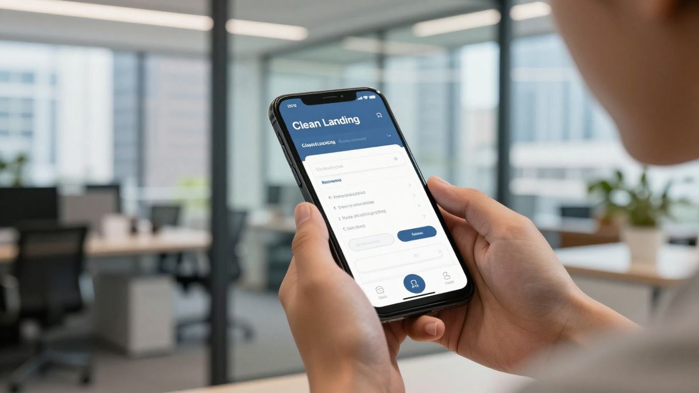
Begin with the narrowest realistic screen rather than shrinking a desktop composition later. Use comfortable text sizes, clear spacing, thumb-friendly buttons, and a layout that keeps the core offer visible without excessive scrolling. Important proof and form fields should remain easy to find.
Check how the page behaves when a visitor rotates the phone, zooms the text, or uses browser controls. Mobile users do not all browse under ideal conditions, so a design that depends on precise tapping or large visual effects is likely to create avoidable friction.
Fast loading protects the attention you paid to acquire. Compress images, remove unnecessary scripts, reduce layout movement, and review third-party tools before launch. Measure the page on a realistic mobile connection rather than relying only on a fast office network.
Core Web Vitals provide useful signals about loading, responsiveness, and visual stability. They are not a substitute for conversion data, but poor technical performance can prevent visitors from seeing the message or completing the form in the first place.
Test the page on current mobile and desktop browsers, different viewport widths, and the devices your campaign data shows. Check menus, buttons, embedded calendars, video, validation messages, and sticky CTAs. A page can look correct in one browser while failing at the moment of conversion in another.
Accessibility checks improve resilience too. Make sure colour contrast is adequate, labels are associated with fields, keyboard navigation works, and important information is not communicated through colour alone. These details help more visitors complete the journey.
Forms should feel proportionate to the offer. Ask only for information needed to qualify, route, or respond to the lead, and explain any field that may seem intrusive. Inline validation and clear error messages are more helpful than making visitors resubmit an entire form.
Use a confirmation state that answers the immediate question: was the request received? Add the next expected step, such as a response window or booking instruction. This reduces duplicate submissions and makes the interaction feel finished rather than uncertain.
Copy should help the right visitor recognise value quickly. It does not need to sound loud or overly polished; it needs to be concrete, relevant, and easy to scan. The strongest wording usually comes from understanding real customer questions rather than inventing clever slogans.
Write for the level of awareness behind the traffic. Someone actively comparing providers needs different information from someone who has only noticed a problem and is beginning to research solutions.
A service description tells people what a business does. A benefit explains why that work matters to them. Replace broad claims such as “professional solutions” with a clear description of the practical change, such as a simpler booking process, a qualified consultation, or a faster route to a tailored quotation.
Benefits should remain honest and specific. Do not promise an outcome that depends on factors outside the business’s control. Explain the value the service is designed to provide and support it with process details or relevant evidence.
Headings should carry meaning even when read alone. Short paragraphs, descriptive subheadings, bullets, and restrained emphasis help visitors find the information that matters to them. Microcopy near a CTA can remove a small concern, such as whether a call is complimentary or what information will be requested.
Use ordinary language wherever possible. Technical terms have a place in specialist industries, but define them when the audience may not know them. A page that sounds like a conversation is often easier to trust than one assembled from inflated marketing phrases.
Objections are clues about missing information. Prospects may wonder about cost, suitability, timing, qualifications, cancellation, privacy, or the amount of work required from them. Address the most common concerns near the relevant section rather than burying every answer in a long FAQ.
A short explanation can be enough. State who the service suits, what the first step involves, and what is not included. This improves lead quality as well as conversion rate because visitors can make a more informed decision.
Singapore audiences are not one uniform group. A homeowner, procurement manager, patient, investor, and event attendee may use different language and care about different proof. Segment campaigns and landing pages when the differences affect the offer, buying process, or qualification criteria.
For businesses managing organic search as well as paid campaigns, SEO content can bring broader research traffic, while a campaign page can stay tightly focused on one action. The page should reflect the source and audience instead of forcing every visitor into the same message.
A lead form is part of the sales process, not an isolated design component. Its fields influence completion rate, qualification, routing, and the speed of follow-up. Decide what the team genuinely needs before adding questions simply because the form builder makes them available.
The surrounding copy matters just as much. Visitors need to understand the value of submitting their details and what will happen afterwards.
Start with the minimum information required to respond appropriately. Name, contact details, service need, and a short qualifying question may be enough for one business, while another may need a project type or preferred appointment time. Every additional field should have a clear operational purpose.
If a field affects lead routing, explain why it is requested. Consider progressive qualification for longer sales processes, where an initial enquiry captures the essential details and a later conversation gathers more context. This can protect completion rates without leaving the sales team unprepared.
A button should tell visitors what happens when they click. “Send enquiry”, “Book a consultation”, and “Request a quotation” are clearer than vague labels such as “Submit” or “Learn more” when the action is known. Match the CTA to the commitment and avoid promising something the next screen does not deliver.
Repeat the same primary wording across the page unless the visitor is moving into a genuinely different step. Consistency makes the journey easier to understand and gives analytics a cleaner structure.
Keep the form visually simple and remove distractions around it. If a booking tool is necessary, make the available times, time zone, and confirmation process clear. If a phone call is more suitable, explain when someone will respond and whether the visitor can request a preferred time.
Review the complete path on mobile. Autofill, clear field labels, and a reliable confirmation page can make a noticeable difference. Also check what happens when a visitor leaves and returns, encounters an error, or submits twice.
Consent language should be visible, readable, and connected to the action. Explain how the information will be used, who may contact the visitor, and where the privacy policy can be reviewed. Avoid hiding important terms in faint text or presenting consent as an accidental default.
The exact wording should reflect the business’s obligations and advice from its privacy or legal team. A transparent explanation supports trust and helps the business handle enquiries responsibly.
A page is not finished when it goes live. Performance depends on traffic quality, offer fit, page experience, follow-up, and the maturity of the campaign around it. Review the whole path from impression to qualified lead or completed event rather than celebrating a form submission in isolation.
Measurement should be useful to the people making decisions. A transparent dashboard and clear definitions can prevent arguments over whether a campaign is producing volume or genuinely valuable opportunities.
Choose metrics that reflect the business goal. Conversion rate, cost per lead, qualified lead rate, booked appointments, event registrations, sales opportunities, and cost per acquisition may all matter, but not every page needs all of them. Define what counts as a conversion before reporting begins.
Separate meaningful actions from incidental ones such as button clicks or partial form starts. These secondary events can help diagnose friction, while the primary KPI should remain tied to a real business outcome.
Tracking should pass enough information to connect the original campaign with the resulting enquiry. Use consistent campaign naming, captured source data, and clear event definitions. Then confirm that leads arrive in the right CRM destination and that follow-up ownership is visible.
For campaign work, Google Ads conversion tracking can support optimisation when it is configured around meaningful actions. The wider setup still needs testing: check tags, consent behaviour, duplicate events, phone conversions, and offline status updates where relevant.
Test one meaningful change at a time when possible. A headline, form length, proof placement, CTA label, or page structure can each affect behaviour, but a test that changes everything makes the result difficult to interpret. Set a primary success metric and allow enough traffic for a useful comparison.
Do not stop a test simply because an early result looks exciting. Review lead quality and operational outcomes as well as the initial conversion rate. A variation that produces more low-fit enquiries may not be the better version.
Analytics shows what happened; behaviour tools and user feedback can suggest why. Look for sharp exits, repeated field errors, slow sections, ignored CTAs, and differences between mobile and desktop journeys. Combine these signals with sales-team observations and customer questions.
Prioritise changes by likely impact and effort. A clearer form instruction or faster page may deserve attention before a complete visual redesign. Record each change, its reason, and its result so optimisation becomes a disciplined process rather than a sequence of opinions.
Effective landing page design Singapore businesses can rely on begins with a focused goal and a clear understanding of the visitor. When the message, proof, mobile experience, form, and measurement all support the same decision, the page becomes a more useful part of the acquisition funnel. Build carefully, set realistic expectations, and improve from evidence rather than guesswork.
A landing page is a focused web page built for a particular audience, offer, and conversion goal. Unlike a general website page, it limits competing paths so visitors can take the intended next step more easily.
A homepage usually serves several audiences and purposes. A landing page can match one campaign message closely, provide only relevant information, and guide visitors towards one primary action.
There is no universal length. The page should contain enough information to answer the audience’s questions, establish trust, and support the conversion goal without adding repetition or irrelevant detail.
Yes. Many campaign visitors browse on phones, so the page should be designed and tested for small screens from the beginning. Forms, buttons, text, speed, and confirmation steps all need mobile attention.
Ask for the information needed to respond, qualify, or route the enquiry. Fewer fields generally reduce friction, but a relevant qualifying question can improve lead quality when it has a clear purpose.
Define the primary conversion, configure tracking for that action, and connect it to lead or sales information where possible. Review conversion rate alongside cost, qualification, appointments, revenue, or other meaningful business outcomes.
Review performance continuously, but prioritise changes when data shows a clear problem such as poor mobile completion, weak lead quality, slow loading, or a mismatch between ad intent and page content. Test focused improvements before replacing a page wholesale.
Singapore SMEs & clinics
Talk to Adrian, the founder. Tell us your goals and budget. We will tell you straight what we would do first, and what we would not spend money on. See a real result: 2.8× more enquiries for a Singapore clinic →


